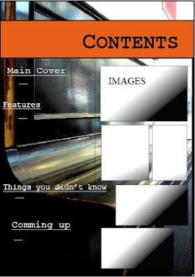
With the contents page, I wanted to carry on the Idea of the Main cover story so for the background i included another image of the same piano but just at a different angle. Again I have used grid lines to position my work with the banner for the contents page and the grid for positioning my contents menu and Images.
I used an orange background for my page title because I wanted the 'easy on the eyes, informal' look. I though that is was quite successful.
For the text on the left had side of the page, I didn't want a straight layout that might have look a bit normal and boring. Instead I wanted to go for a 'school sketch book' layout with the fonts different sizes and out of alignment to give quite a funky effect. Again, I used the same font as the page title and the Mast Head on the front cover to introduce a running font type theme and some organisation in the magazine.
The reason I placed the images relative to the text on the right hand side, is because when someone opens a book the first thing they are going to see is whats on the right hand side of the page. So instead of text that the reader might find a bit normal and usual, I added some images of the stories and contents of the magazine. This will automatically draw in and interest the reader. Again the frames for the Images are out of alignment and use different sizing on purpose to give that 'college/school house' look.
No comments:
Post a Comment